Brand Design
Logo Design & Branding
Logo Design & Branding
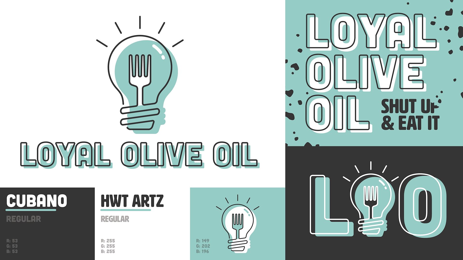
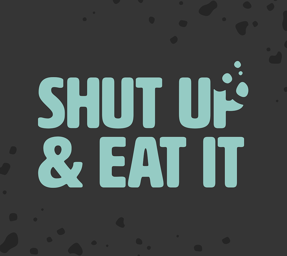
LOYAL OLIVE OIL
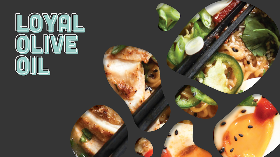
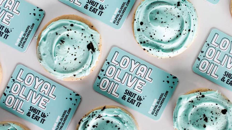
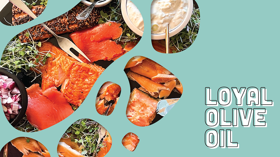
Logo design and branding for my wonderfully talented wife's food & photography blog called "Loyal Olive Oil." Balancing between professional and tongue-in-cheek, the LOO brand aims to be both slick and playful culminating in the tagline "Shut up & Eat it". Vector crumbs sprinkled throughout the design express the playful messiness of cooking while maintaining a purposeful design aesthetic.
Below is the final brand guide as well as a variety of marketing materials including the client's photography and a variety of animated gifs for their website and socials. Designed in both Adobe Illustrator and Photoshop.
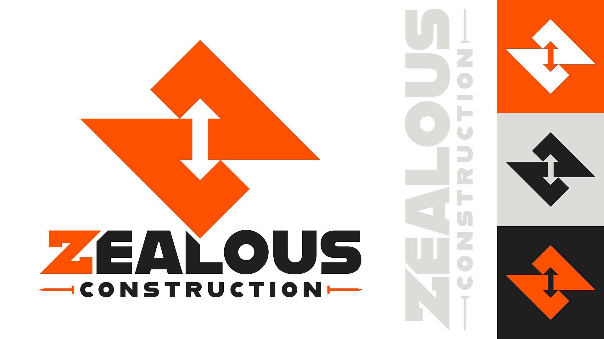
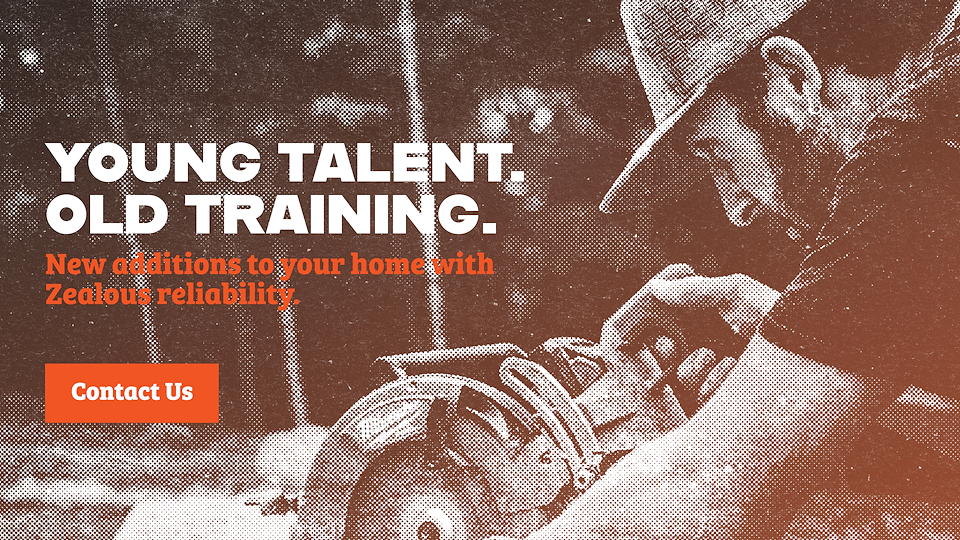
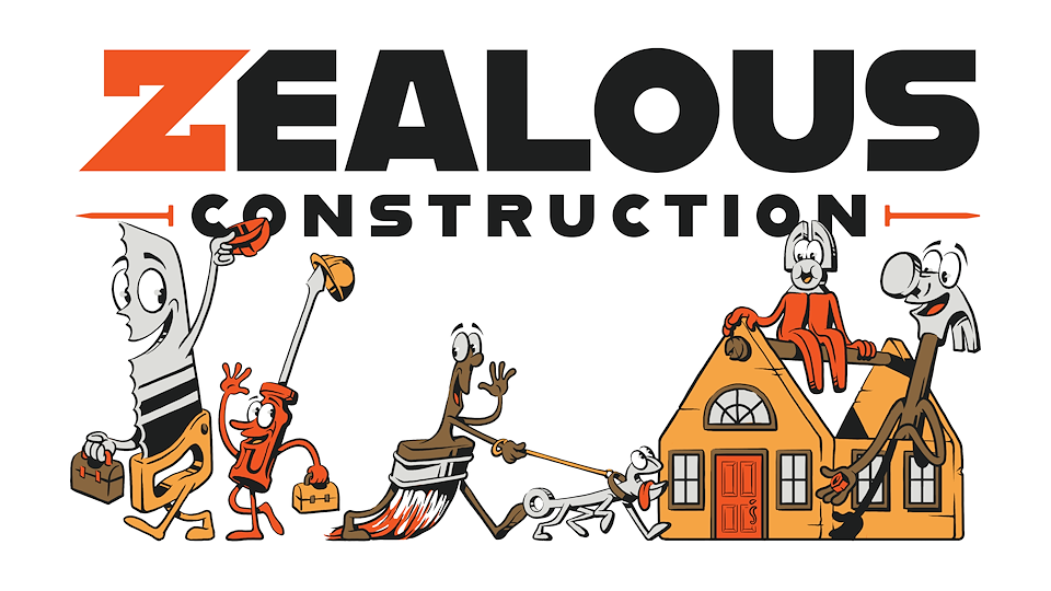
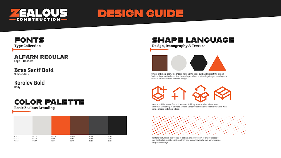
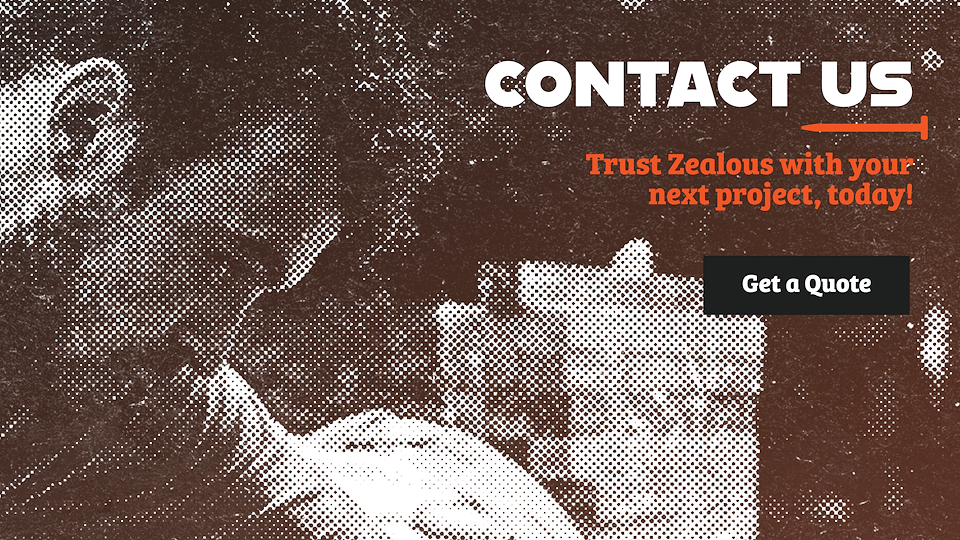
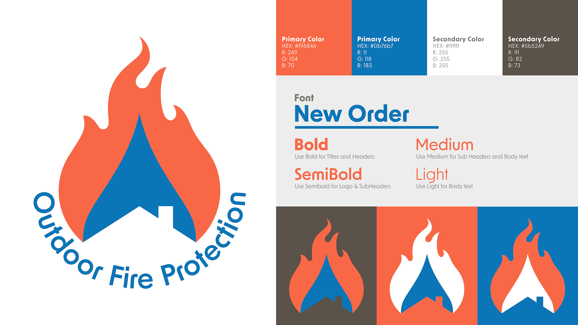
ZEALOUS CONSTRUCTION
Logo & brand design for a New England construction company that combines the youthful vigor of the construction team itself with the confidence & wisdom gained from a decade of on-the-job experience. While maintaining a modern, slick design the branding makes an effort keep some of the job site grit with half-tone textures sprinkled throughout.
You can find the brand guidelines as well as banner images and illustrations below. Designed entirely in Adobe Illustrator & Photoshop.
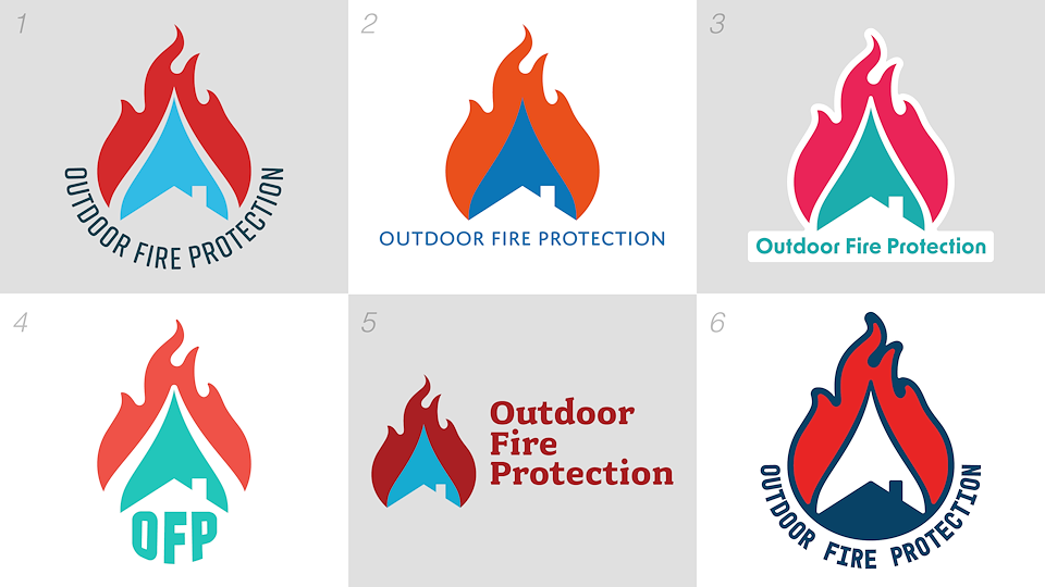
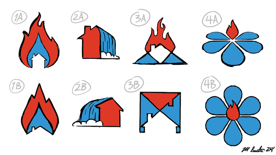
OUTDOOR FIRE PROTECTION
Logo design for a Los Angeles native company, heart-set on protecting homes from the devastation of forest fires. Utilizing a patented backup water system, "Outdoor Fire Protection" creates a forcefield around your home using sprinklers. It was that very same idea that inspired the logo of a water droplet shielding a home from surrounding flames.
Below is the finished logo design guidelines as well as the many variations along the way. Sketched in Photoshop and designed in Illustrator.
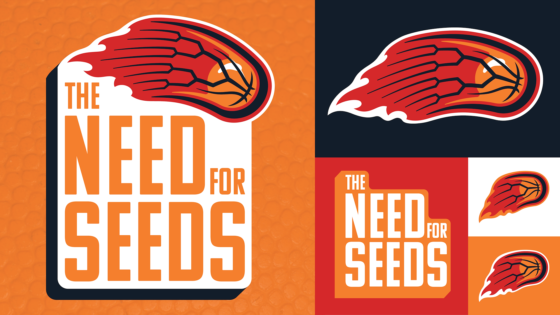
THE NEED
FOR SEEDS
Although capitalizing on its raunchy name, I assure you, "The Need for Seeds" is just a basketball podcast focusing on March Madness Seeds. Playing around with the image of a sports bracket, I was able to integrate it with the instantly recognizable symbol of a basketball on fire. Together, this logo looks familiar, with a cheeky twist hidden in its design.
Designed entirely in Adobe Illustrator.
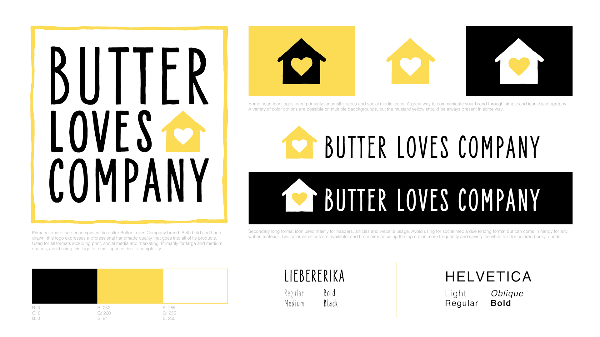
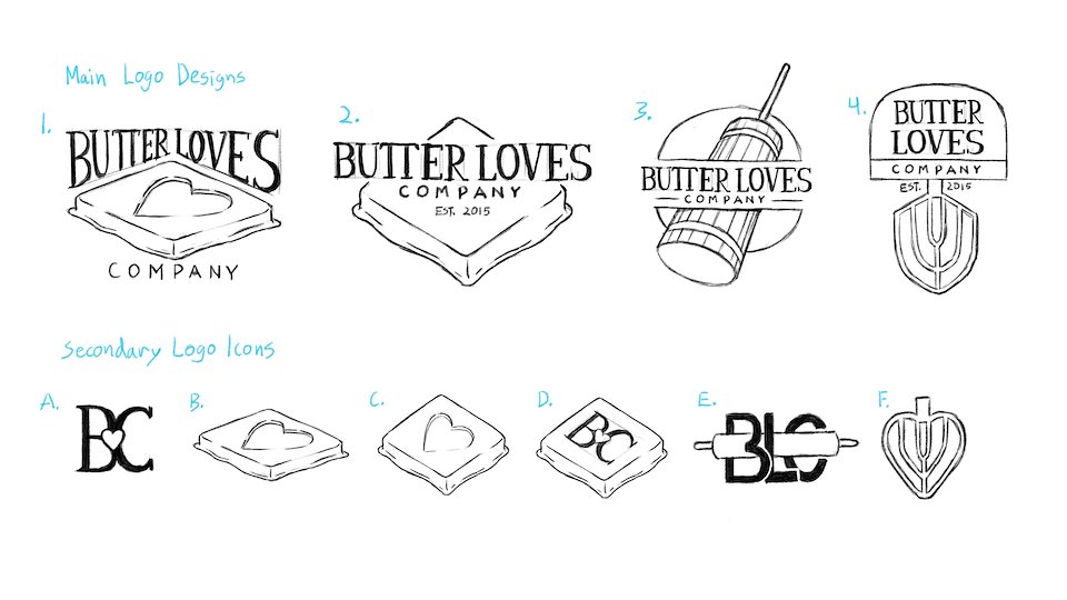
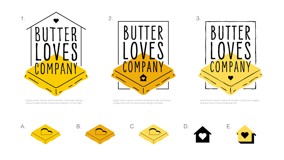
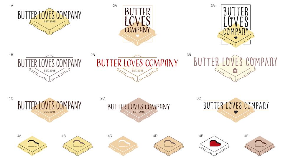
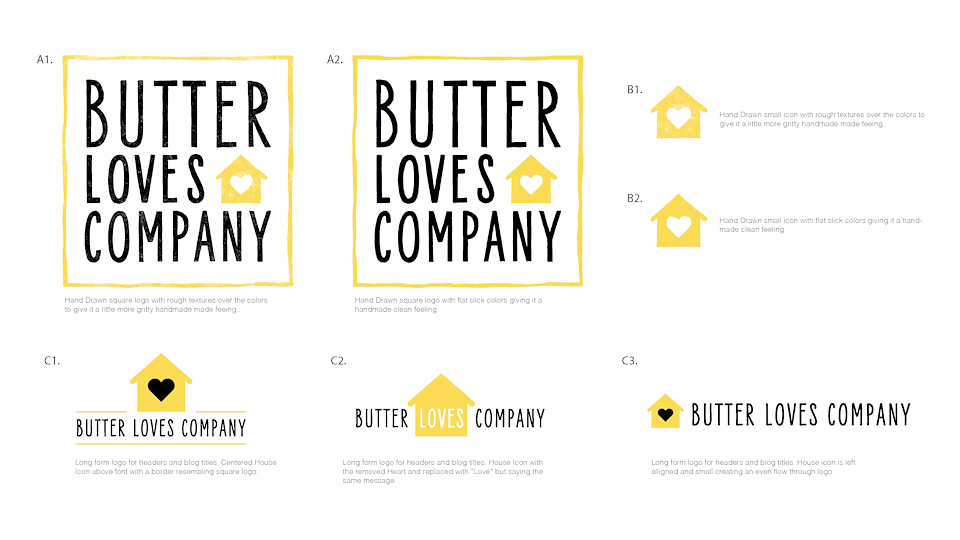
BUTTER LOVES COMPANY
Logo design and branding for "Butter Loves Company"; a blog focused on baking, cooking and recipes. The brand focuses on handmade products with a dash of love and passion which inspired a bold hand-drawn logo design. The logo designs consist of a large logo for primary use, a horizontal logo for website and page headers, and a secondary small icon for social media and videos.
Below is the final brand guide and some of the design process to get to the final product from sketch to the final product. Designed in both Adobe Illustrator and Photoshop.
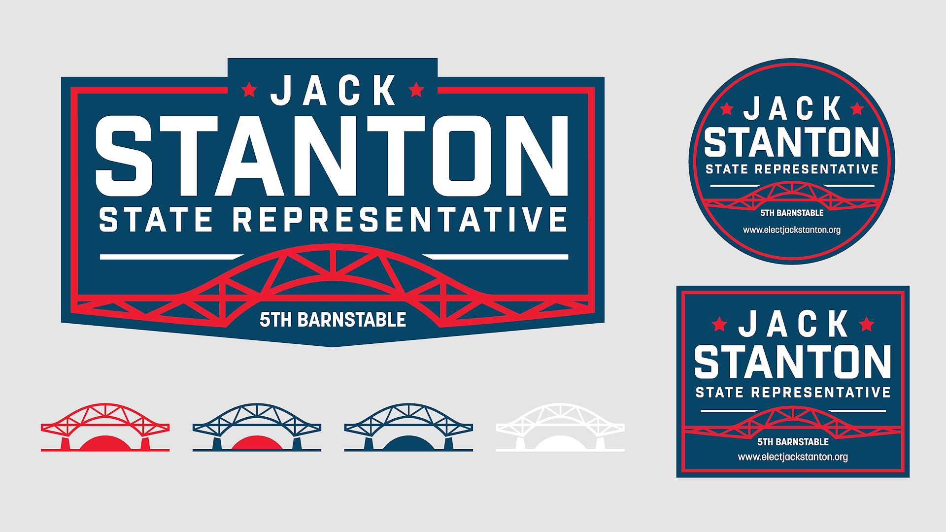
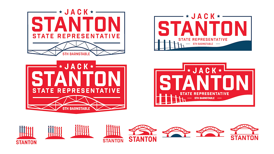
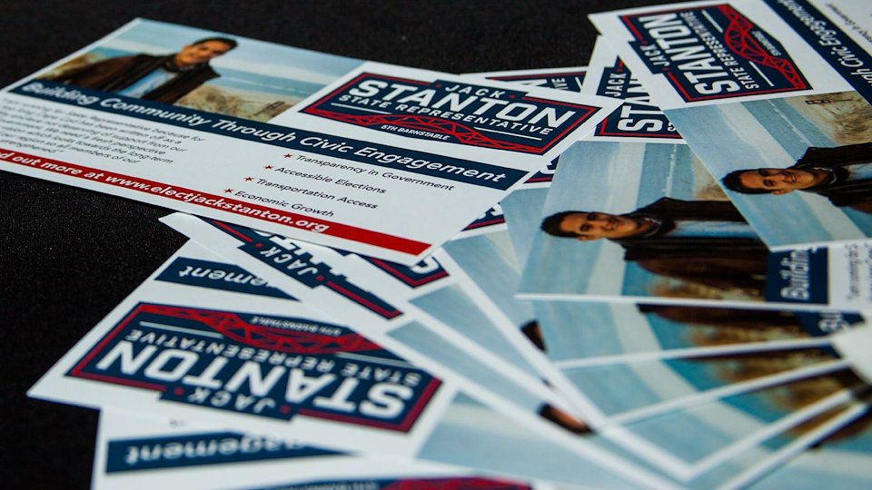
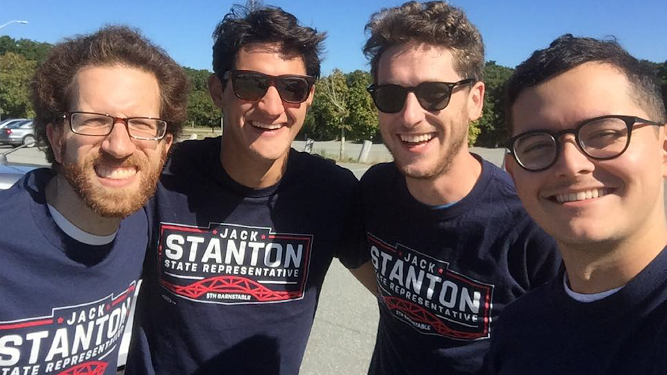
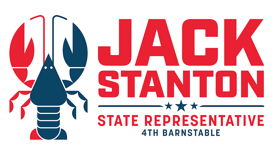
JACK STANTON CAMPAIGN
Logo design and branding for Jack Stanton's political campaign run for state representative of Massachusetts. As a local to Cape Cod, Jack wanted the design to have the Cape in its DNA so we focused the design around a famous local landmark, the Sagamore Bridge. The branding includes a primary large logo, secondary logos for buttons and stickers, and a small icon for documents and social media.
Designed entirely in Adobe Illustrator.